
The starting point
The original logo’s watercolor scene and wordmark provided a reference for the refined identity.
A bilingual website and an identity that keeps the community’s meaning intact.
CNW Alliance needed a website that reflected its community and welcomed visitors in English and Spanish.
Steelo refined the visual identity, preserved its meaningful symbols, and rebuilt the website in both languages.


click or drag the handle to compare
The logo shift was not a cosmetic swap. It translated CNW Alliance from a soft illustration-led mark into a clearer symbol system that can hold up across a bilingual website, referral forms, and small digital placements.
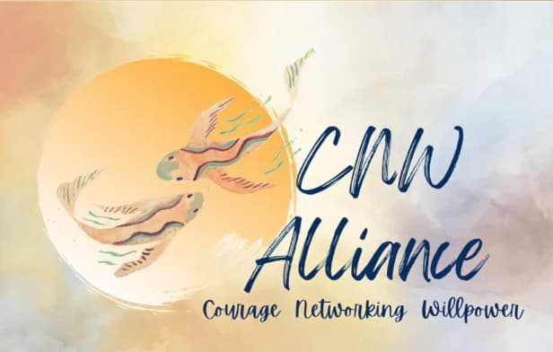
The original logo’s watercolor scene and wordmark provided a reference for the refined identity.
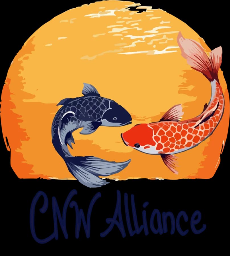
The new mark preserves the koi and sun in an emblem for the bilingual website.
The refined identity connects the website, language controls, and inquiry path.
Refined identity, bilingual website, and digital inquiry path.
An organization ready to bring its identity and website together in two languages.
A refined identity, bilingual website, and digital inquiry path.
Visitors have a clearer view of the organization and a more direct path to make an inquiry.
Conference identity and event marketing materials for Women on a Mission for Change.
A new identity, website, and branded materials for Lucy Maid Cleaning Services.
A unified identity, website, and communications system for JM Advancement.